
Crafting Beverage Identity: Inside Swig Studio's Approach to Memorable Packaging Design


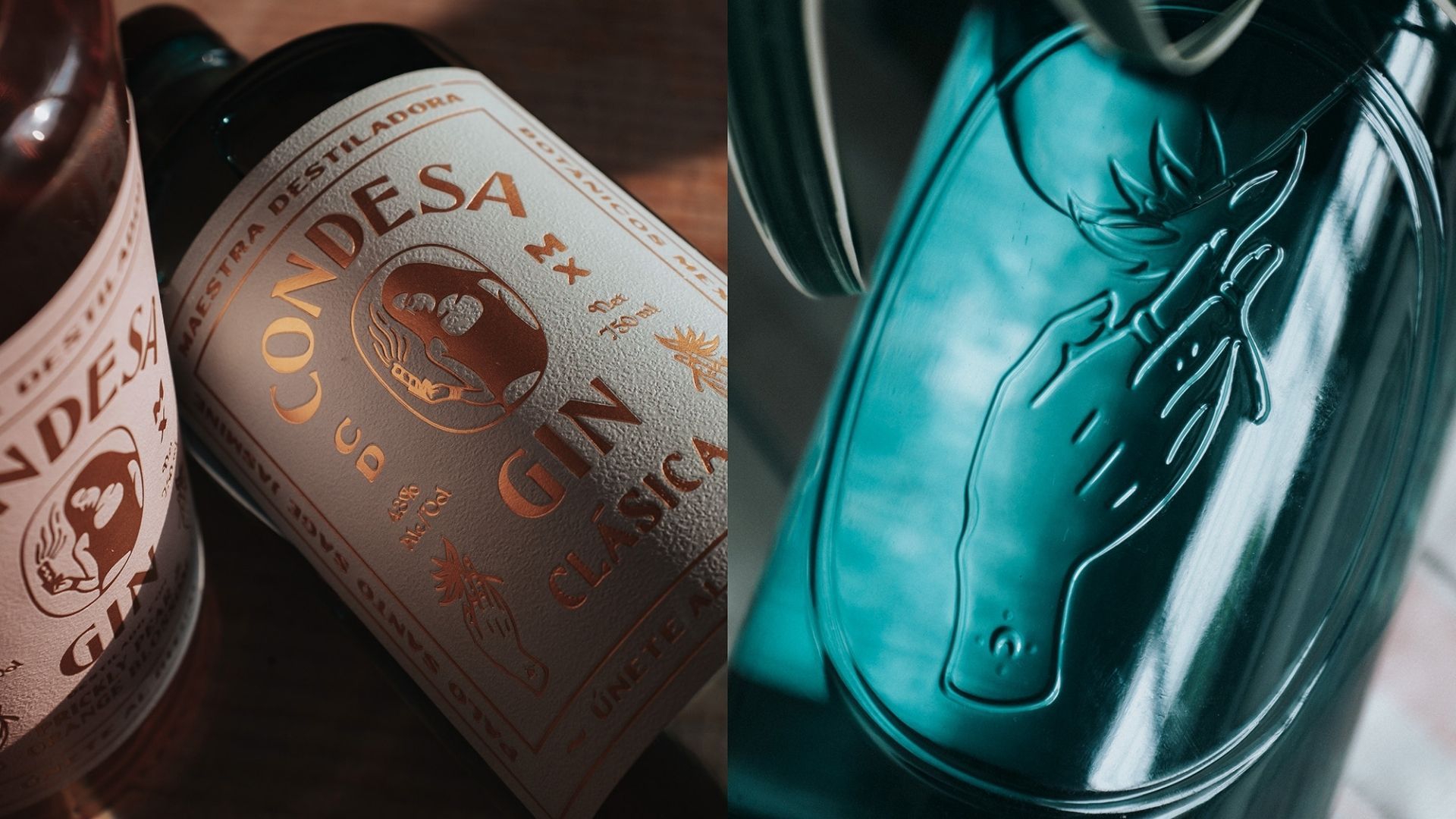
Throughout my years as a brand marketer, I've had the privilege of meeting and collaborating with extraordinary creative minds who have shaped and elevated some of the most compelling brands in the beverage industry and beyond. There's something magical about watching talented designers transform a product vision into tangible packaging that captivates consumers and tells a brand's unique story. Among these remarkable talents I've had the chance to meet along the way are Kevin Roberson and John Morales, the creative force behind Swig Studio, whose distinctive packaging designs have helped define iconic beverage brands such as Bozal Mezcal, Suerte Tequila, Skratch Labs Sports Nutrition, and Condesa Gin.
Packaging Is Critical to Beverage Brand Success
What impresses me most about Kevin and Paul's work is their remarkable range. They are storytellers who skillfully use materials, textures, patterns, typography, and more to create amazing packaging for beverage brands. This storytelling prowess is evident throughout their approach. Some of the main takeaways from our conversation include:
Harmony and Distinctiveness: Their holistic approach to brand development encompasses strategic positioning, memorable naming, and compelling tactile elements that work together seamlessly.
Importance of Naming: They emphasize that naming is perhaps more crucial than visual design—even the most stunning label can't overcome a forgettable name that consumers can't easily recall at a bar or store.
Physical Inspiration: Swig Studio prioritizes real-world research, observing products in physical spaces like bars and specialty retailers rather than relying solely on digital inspiration.
Packaging That Transcends Function: They aim to create packaging so appealing that consumers keep the bottles as display pieces long after the beverage is gone—turning packaging into lasting brand ambassadors. Or more romantically, fits just right into the story of the consumer.
Read more about their approach, inspiration, and process below:
Can you share the story of how your packaging agency got its start in the beverage industry? What inspired the focus on beverage packaging?
We founded Swig after working for other design firms, where we each gained experience in branding and consumer packaging. It was a bit of an auspicious moment around 2005 when Paul and I were both working independently. We threw out the idea of starting a design business together, and after looking at our combined portfolios, we just happened to have drinks packaging projects in all the main categories: wine, spirits, beer, soft drinks, and coffee. So, our decision to specialize was almost predestined.
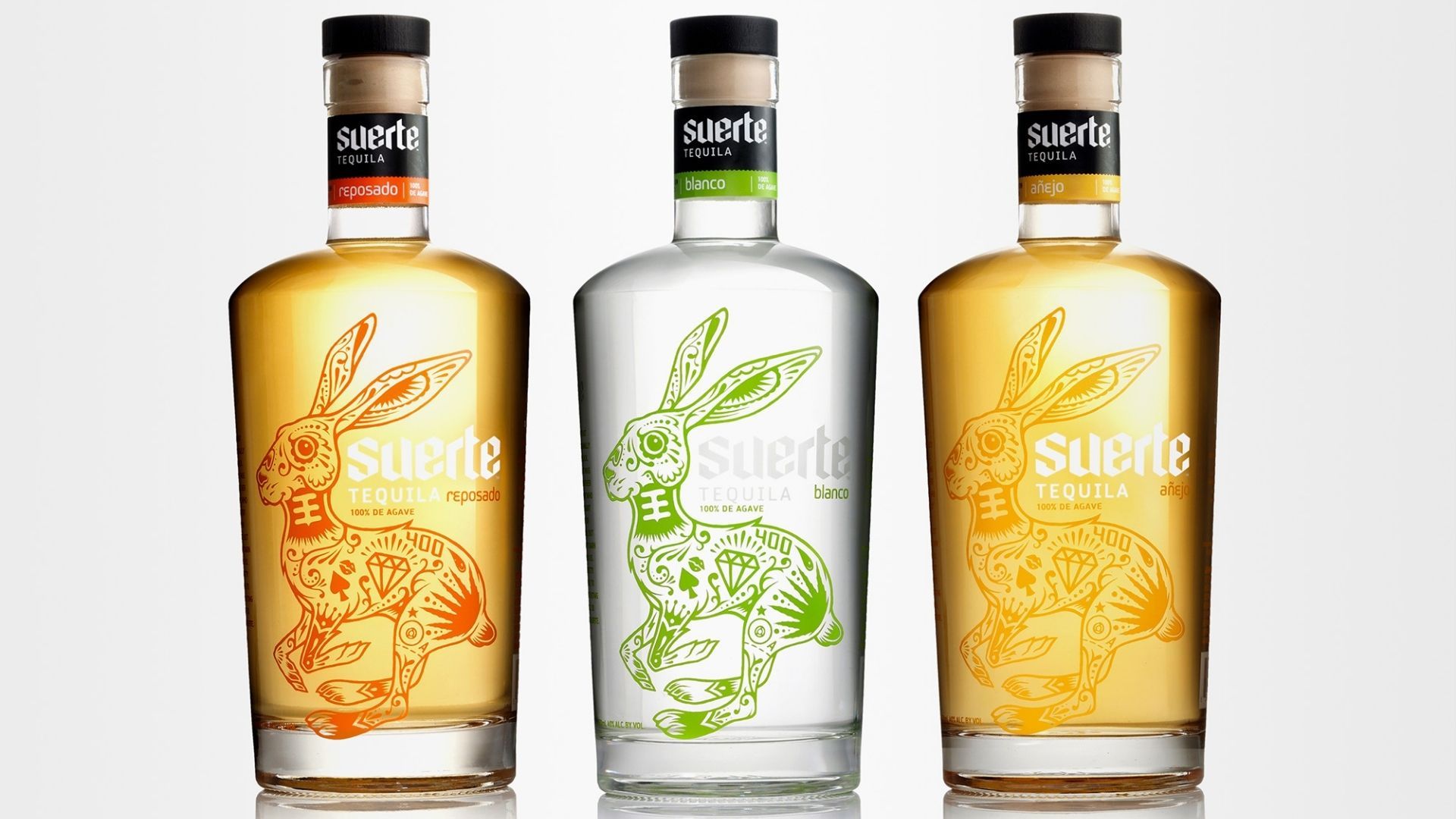
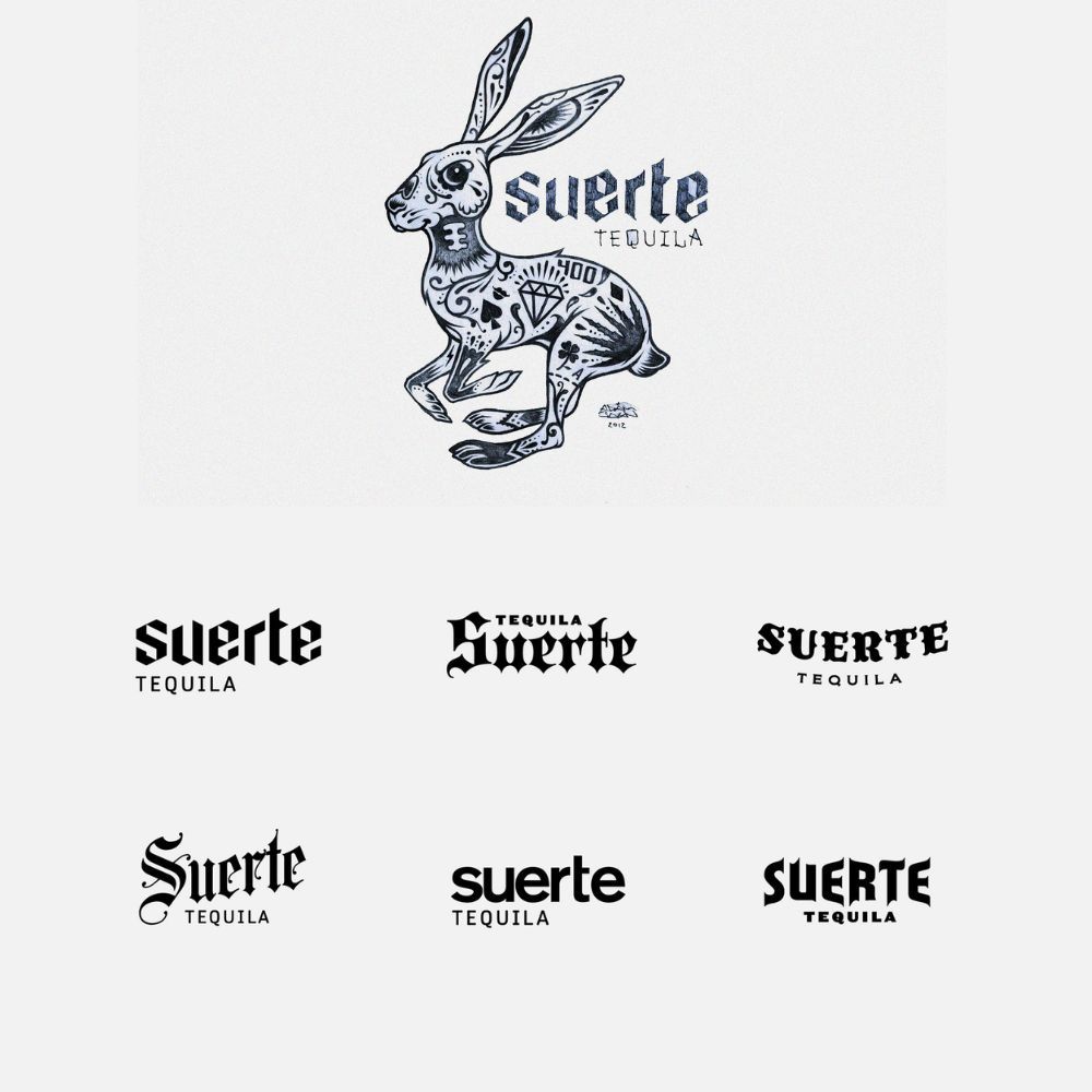
Our first major project was for Suerte Tequila. It was a great opportunity to help a pair of entrepreneurs create a brand from scratch. It was an interesting learning experience for us since we were not very familiar with the agave category. Agave has such a rich history, and the Tequila category has many nuances. The positioning for Suerte was unique because it was one of the first "new wave" Tequilas that use traditional methods, but targeting a more youthful American audience. The project encompassed naming, identity, and packaging, providing a unique opportunity to develop all aspects of the brand and utilize our strategic, visual, and tactile skills. The experience really helped us develop our upfront creative strategy process as well as learn more about the production process.
Where do you draw inspiration from when designing packaging for different beverage categories?
We love to get out into the physical world. Especially today, with thousands of great packaging examples at your fingertips via screens, it's even more important to touch and pick up things. We enjoy visiting bars, specialty retailers, and even wineries and breweries to see packaging and brands in a real-world context. We love just observing consumer trends develop and evolve, and hearing how consumers talk about brands.
Looking back at your agency's journey, what project would you consider your biggest success story and why?
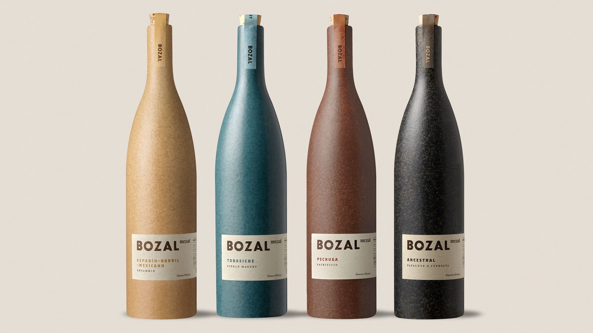
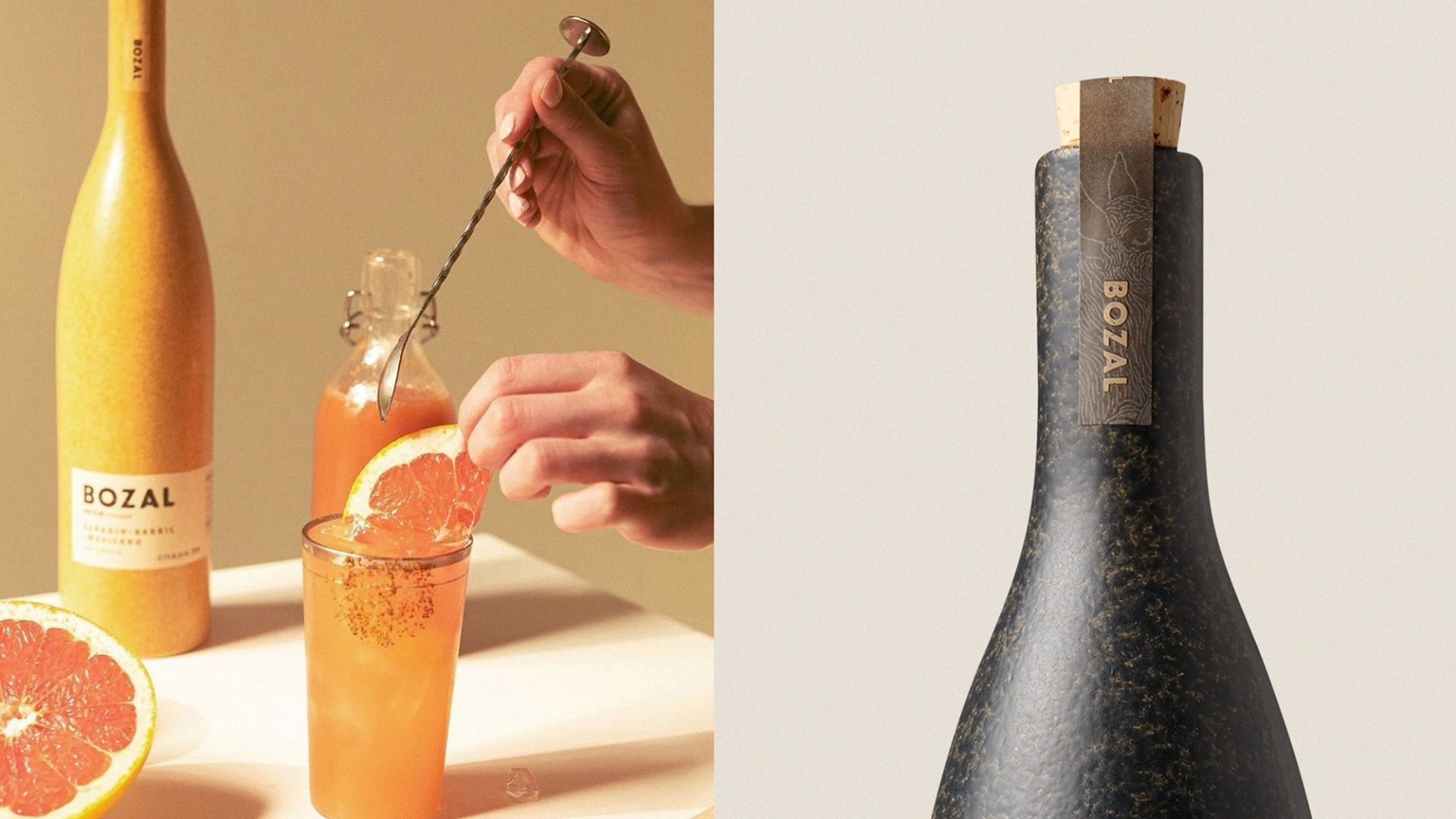
Our favorite projects are those where all the stakeholders feel connected to the brand — our clients as business owners, ourselves as designers, and the audience as curators. Even with all the best planning, creating a brand is really a hands-on, organic thing. So, for example, when we presented our design concepts for Bozal Mezcal, our client gravitated toward the most out-of-the-box direction. We were thrilled, but then had to figure out a way to produce it without blowing up the budget. We worked closely with our client to find the right producer and did endless tests to get the material and decoration just right. After the launch, we got a lot of feedback from consumers who either wanted to keep the bottles around after the mezcal was gone or even just wanted bottles to display in their home. So I guess to us, the biggest success for a packaging project is when there is business success and brand recognition for our client, creative satisfaction for us as designers, and positive feedback from consumers who love it.
What are the most significant packaging trends you're seeing emerge in the beverage industry today? Are there different trends for different beverage categories?
The wellness and health trend is emerging as one of the most important of the decade. Concerns about what we're actually drinking are affecting almost every category — from non-alcoholic wine, probiotic sodas, additive-free spirits, zero-carb drinks, etc. Of course, there are also visual trends that reflect different cultural currents. Those seem to change more quickly.
Do you have a typical design process, from the initial client brief to the final production?
Our process is fairly similar to that of other design agencies. We always start with a well thought out creative brief, develop concepts, narrow down and vet, then produce. Occasionally, a client will need help with brand strategy or finding a creative positioning, but other times, they have a good idea of where the packaging or brand should go. We can start creative at any point along that journey. One of the key points for us is that all the branding building blocks work in harmony: strategy, name, logo, product style, flavor profile, visual design, and format. Sometimes, we will question whether one of these needs adjusting in order to make a better, more coherent product.
In your experience, what elements of packaging design have the greatest impact on consumer purchasing decisions for beverages?
While we are visual designers first, we believe that naming is probably more important than a cool graphic label. (Although that is also important!). Without a memorable, good-looking name that you can easily call at the bar or store… a brand has got a much more difficult road ahead. This idea extends across all drink categories. In addition to naming, a tactile element will help someone want to touch or pick something up. Think heavy paper stock, textured glass, embossing, diecuts, etc. That is half the battle to getting a bottle from the shelf into the shopping cart.
What unique challenges do sports beverages or non-alcoholic beverages present compared to alcoholic products when it comes to effective packaging design?
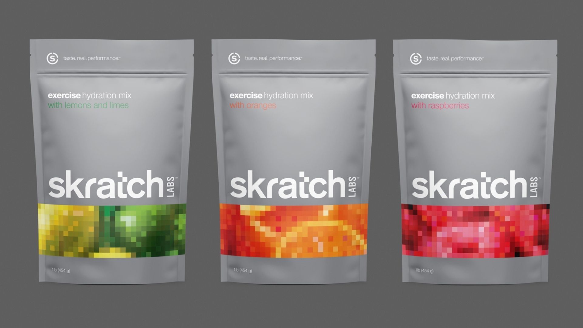
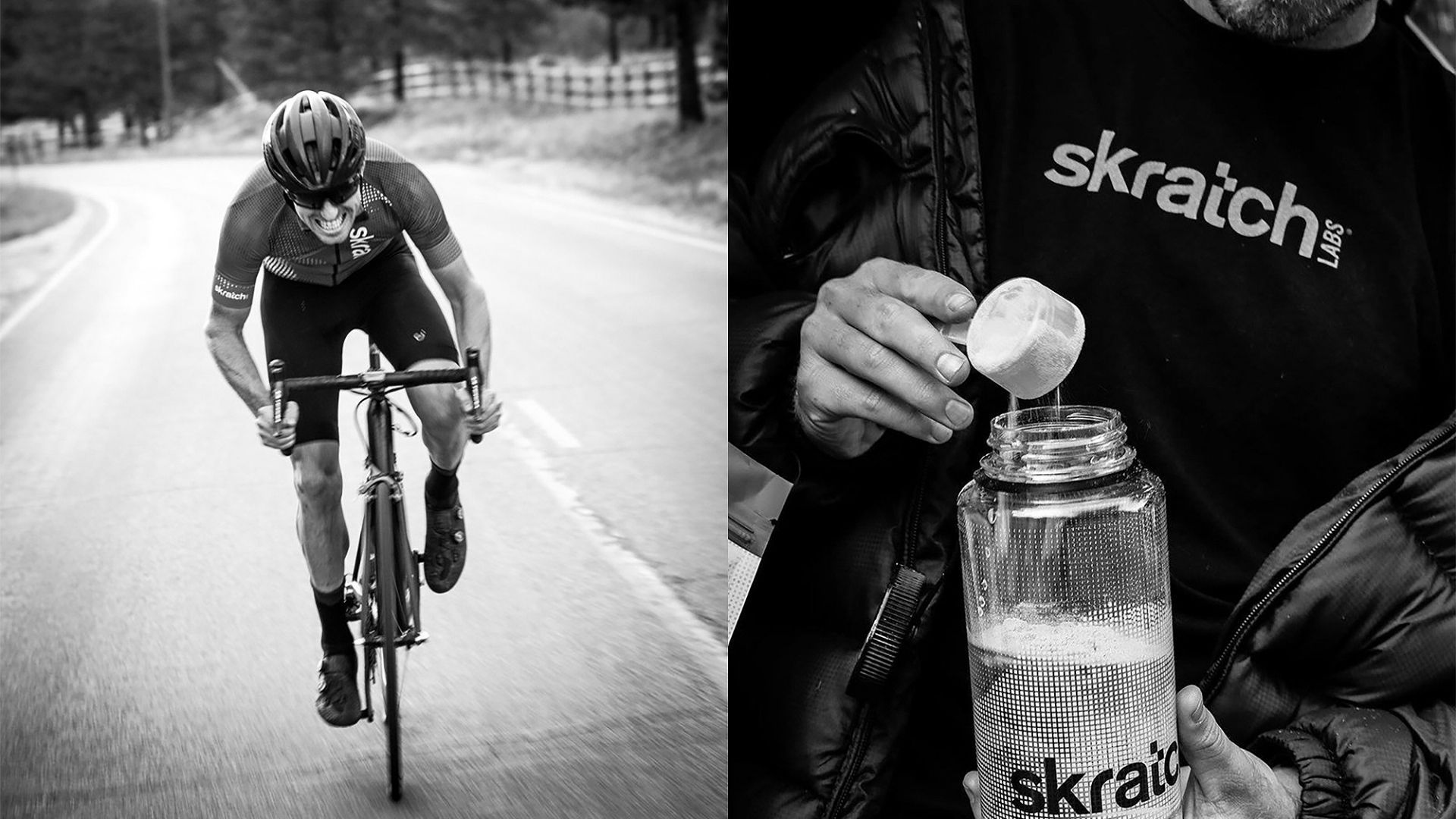
The sports and refreshment categories have slightly different challenges since many products are driven by function. It could be high energy, relaxation, or recovery from exercise. So, packaging needs to communicate more than just the brand vibe, but also the unique benefit properties of the liquid. We'd love to work on a few more sports drinks. We had the chance to create the Skratch Labs branding and packaging when the company launched. We took a more scientific, minimalist approach than many other drinks in the category.
Looking ahead, what innovations or changes do you anticipate will shape beverage packaging design in the next 3-5 years?
The industry still faces challenges related to sustainability. There have been numerous attempts to use less material and more recycled and recyclable materials, but we're still far from where we need to be. I think there are something like 50 billion single-use plastic bottles sold every year in just the US. So, I'm hoping we designers will get serious about helping solve some of these issues.
What's next for Swig Studio?
We are always excited about the next project. Whether it's a start up new brand or a huge rebrand. We are currently at work on a Mendocino County wine brand and we just finished a new soda line extension for Spindrift. Thank you!
Final Thoughts
This discussion with Kevin and John reveals that exceptional beverage packaging design balances art, strategy, and consumer psychology. Their journey from working on their first major project for Suerte Tequila to developing distinctive packaging for brands across the beverage spectrum demonstrates how specialized expertise can truly elevate a product in a crowded marketplace.
The insights they've shared about the design process, emerging trends like the wellness movement, and the challenges facing sustainable packaging give us valuable perspective on both the current state and future direction of beverage branding. Their emphasis on tactile elements and memorable naming serves as an important reminder that effective packaging engages multiple senses and creates lasting impressions.
I want to extend my sincere thanks to Kevin and John for sharing their expertise and experiences. If you'd like to explore more of Swig Studio's impressive portfolio, visit their website at swigstudio.com, connect with them on LinkedIn or follow their inspiring work on Instagram.
A note to readers: If you're planning a packaging project for your beverage brand and need guidance on finding the right designers, developing effective strategies, or establishing appropriate budgets, please reach out. I'd be happy to discuss how to approach your project with the same level of thoughtfulness and creativity that firms like Swig Studio bring to their work.